Tork Using Brain Wave Technology to Investigate How Restaurant Guests React to Colors Tweet
Colors affect the mood and behavior of humans. And although there are many aspects within a restaurant that affects the experience of a guest – color is a critical one. To provide inspiration and food for thought around colors, SCA and its global hygiene brand Tork has used brain wave technology to measure how guests react to different colors. The result shows clear and reoccurring patterns in moods and emotions provoked by different colors.
“Colors make life richer and restaurants are no exception. If buying a new car you would probably spend considerable time choosing the color. How about the color on your tableware?”, says Julia Wood, Senior Product Manager for Table Top at SCA Tork.
To investigate how colors affect the experience of restaurant guests, Tork has created an experiment.
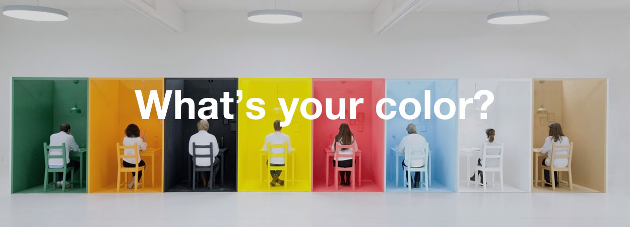
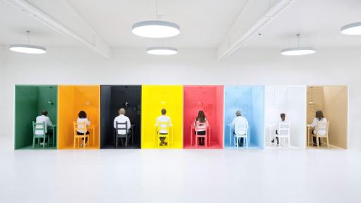
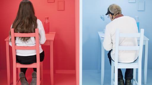
16 guests equipped with brain wave headsets got to experience 8 different environments in 8 different colors. Each setting was designed with restaurant attributes completely covered in a monochrome color – from walls and floor to furniture and tableware.
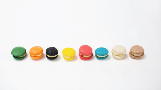
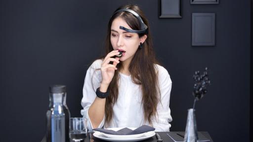
For each color experience the guests were asked to taste a drink and a miniature Macaron cookie – identical in all aspects except for the color, matched to the surrounding environment. For every setting, brain activity and heart rate was measured, alongside a questionnaire to inventory the reactions from the participants.
“Goethe created the first color theory in 1810. This isn’t an ambition to challenge existing theory but rather contribute with additional color insights, specifically related to a restaurant environment”, says Julia Wood, Senior Product Manager for Table Top at SCA Tork.
The analysis showed clear and reoccurring patterns in moods and emotions provoked by different colors. The colors were also perceived to be suitable for diverse kinds of meals and with special restaurant experiences ranging from a romantic dinner date to a formal business lunch. For example, red stimulates strong emotional connections and creativity, while blue boost a calm experience. All data and findings from the testing have also been analyzed to create a profile for each color. The aim is to provide inspiration and food for thought for the hospitality industry (profile highlights below).
|
The meditative green: The brain wave results indicate a revitalizing quality for the green color, with restorative deep relaxation and immune system improvement. The heart rate was also below average in this room. In line with this, the green color was described as relaxing, calm and welcoming. It was perceived to be suitable for lunch or coffee with people you know well. An environment in which to recover and heal, rather than get excited or experience romance. |
The happy orange: Overall, orange was perceived as modern and fun typically associated with happy experiences together with kids and friends. On the other hand orange could also be seen as somewhat unromantic, a bit stressful and not luxurious. The brain wave and heart rate results showed that orange might be a more neutral choice compared to other strong colors such as yellow. Orange also gave mid-range indications of gamma waves, associated with learning and information processing. |
|
The sophisticated black: Black is a color of complexity. It was perceived as luxurious, modern and sophisticated but at the same time a bit unwelcoming and boring. It was strongly perceived to be suitable for a sophisticated dinner date or evening drinks - events where you leave your kids at home. The brain wave readings indicated high levels of creativity and arousal, but also a lower level of focus – making it less appealing for business set-ups. |
The exciting yellow: Yellow is an exciting and fun color, suitable for an arousing environment. The brain wave results indicated higher states of arousal and conscious focus, but in extreme cases also higher stress levels. Also, both the average and max heart rates where high for yellow. The color was perceived to be suitable for breakfast experiences, perhaps to lift the mood and give an energy-boost in the morning. Yellow was also the most popular color for venues where to bring kids. |
|
The romantic red: Red that stands out and provokes powerful emotions rather than blending in. Red gave high indications in the delta and theta brain wave ranges - meaning strong emotional connection and high levels of creativity. Heart rate results were also high, indicting a stimulating environment. Perhaps not surprising, red is strongly associated with romance and evening drinks. However there is also an exciting and fun side of red. |
The calm blue: The blue color gave high indications in the delta wave range, which means deeply relaxed states. High theta waves also indicate creativity and high emotional connection. This responds to the fact that blue was described welcoming, calm and relaxing. Blue was perceived to work well for a family-friendly venue to have breakfast or coffee, |
|
The traditional brown: Brown scored low on the majority |
The luxurious white: White stood out and yielded |
“Colors have been around forever but brain wave technology is new. As Europe’s biggest manufacturer of tabletop products we wanted to use the opportunity and investigate how our colors contribute to the experience of guests using them”, says Julia Wood, Senior Product Manager for Table Top at SCA Tork.
The color nuances used in the experiment are derived from the color palette within the Tork tabletop assortment, and napkins from Tork were also used as a part of the monochrome settings.
Tork has a complete range of tabletop products such as napkins, tableware, dispenser napkins and custom print solutions. Besides the variety in color, the assortment stretches across several sizes and qualities, where for example napkin products ranges from conventional napkins to high quality single-use napkins with a luxurious textile look and feel.
- Link to information about the initiative: http://www.tork.co.uk/about/whytork/horeca/
- Link to the new tabletop assortment from Tork: http://www.tork.co.uk/recommendations/focus-areas/dining/full-service/
More information about the color experiment
The study was executed by research agency United Minds on commission by Tork with the purpose of testing how colors affect the dining experience. The experiment was held at the venue Färgfabriken (“The Color Factory” in Swedish) in Stockholm, Sweden on December 2nd 2015. The test was performed with 16 individuals, distributed into four separate sessions, providing 128 unique observation points. The test persons were recruited to ensure a good demographic variety. Each of the test subjects was equipped with an EEG recorder headset (MindWave Mobile) and a heart rate wristband (Mio FUSE) throughout the experiment. The test subjects spent five minutes in each room. During each session the EEG device recorded five observations of brain wave data per second, resulting in some 1500 brain wave observations per room and person. The heart rate was recorded continuously in each room. After each five-minute session, the rooms were restored and test subjects moved to the next room and followed the same identical procedure. To minimize the effect of fatigue and routine on the overall results, the experiment was designed so that each room had the same number of starts and finishes. All data were aggregated room by room and then analyzed in relation to other rooms in order to reveal potential differences in experience that could be due to the change in colors.
More information about brainwaves
Brainwaves are patterns in the electrical activity of our brains. This activity can be observed in five distinct frequency ranges called, from highest to lowest frequency: gamma, beta, alpha, theta and delta. Different brainwaves are associated with different functions in our brains. For example, gamma waves are associated with cognition and information processing, while beta waves have to do with conscious focus and problem solving. Alpha wave activity is increased when we are in relaxed states, while theta waves are associated with creativity and emotional connection. Delta waves have to do with our deepest levels of relaxation and restorative deep. At certain times, one brain wave is more dominant than others, although all are present to some degree all the time. Through research, scientists have been able to interpret brainwaves.
For more information, please contact:
Amelia Baker, Brand Communications Manager, UK&I
E-mail: [email protected], Phone 07769 247799
About Tork®
The Tork brand offers professional hygiene products and services to customers ranging from restaurants and healthcare facilities to offices, schools and industries. Products include dispensers, paper towels, toilet tissue, soap, napkins, and industrial and kitchen wipers. Through expertise in hygiene, functional design and sustainability, Tork has become a market leader. Tork is a global brand of SCA, and a committed partner to customers in over 80 countries. To keep up with the latest Tork news and innovations, please visit: www.sca-tork.com
http://www.sca-tork.com
About SCA
SCA is a leading global hygiene and forest products company. The Group develops and produces sustainable personal care, tissue and forest products. Sales are conducted in about 100 countries under many strong brands, including the leading global brands TENA and Tork, and regional brands, such as Libero, Libresse, Lotus, Nosotras, Saba, Tempo, Vinda and Zewa. As Europe’s largest private forest owner, SCA places considerable emphasis on sustainable forest management. The Group has about 44,000 employees. Sales in 2015 amounted to approximately SEK 115bn (EUR 12.3bn). SCA was founded in 1929, has its headquarters in Stockholm, Sweden, and is listed on NASDAQ OMX Stockholm. For more information, visit www.sca.com.


